MY GRAPHIC DESIGN CLASS IS GRADUALLY DELVING DEEPER AND DEEPER into the world of typefaces and all of their glory. I couldn’t help but get a little giddy about our upcoming project, in which we were each assigned a font and instructed to communicate the essential characteristics of the typeface and highlight unique letterforms that distinguish the face from others that are similar.
My instructor assigned typefaces in class, allocating to each student the font he thought most appropriate to his or her personality and style. I often do this in my head to people, though I am embarrassed to admit. She looks like a Comic Sans, he looks like a Century Schoolbook, they go together like Helvetica Neue UltraLight and Helvetica Bold. She’s a diehard Times New Roman-er. He’s been using Skia Regular since 1996 and frequents Wingdings…
I was hoping for something smooth, perhaps Univers, Frutiger, maybe Garamond or Bauhaus. I would have been more than happy with Helvetica (my first love); however, I am definitely not opposed to expanding my horizons.
I really didn’t think that ‘smooth’ was too much to ask for, so you can imagine my chagrin when the instructor pointed at me and said not Century, nor Futura, but something much less desirable.
“Palatino.”

Okay, okay. So Palatino is, indeed, a LARGELY successful typeface! It has been one of the most used and copied typefaces in history (you know what they say: imitation is the sincerest form of flattery!) That doesn’t make up for the fact that I want to slap it on the cover of a textbook, or perhaps inside of a textbook. Or maybe on the cover of a Kenny G album (all caps, KENNY). I think this font may also be used on wedding invites, grad announcements, and funeral programs alike (aside from Palatino, this is something only Lucida Handwriting and Comic Sans can claim.)
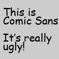
Things could have been a lot worse. If it weren’t for my instructor’s savvy taste, I could have easily ended up with Comic Sans (official font of the 2nd Grade and Beanie Baby typeface), Arial (Helvetica’s trashy second cousin), or maybe “Bad Mofo” (special to dafont.com and resembles robot poop.)
Enough is enough, it’s really not that bad. I was only hoping that I was more than a Palatino, that’s all. I suppose it is a designer’s job to be open-minded about these things and work with what they’re given, be it Wingdings, Webdings, Brush Script (UGH!), or yes, even Palatino. Things could be much, much worse.
SuperNerd, over and out. I’ve got a date with an 11 x 17 Illustrator document and Palatino.
